Soft Light, Strong Glass: Picking Stained Glass for Britain’s Diffuse Daylight
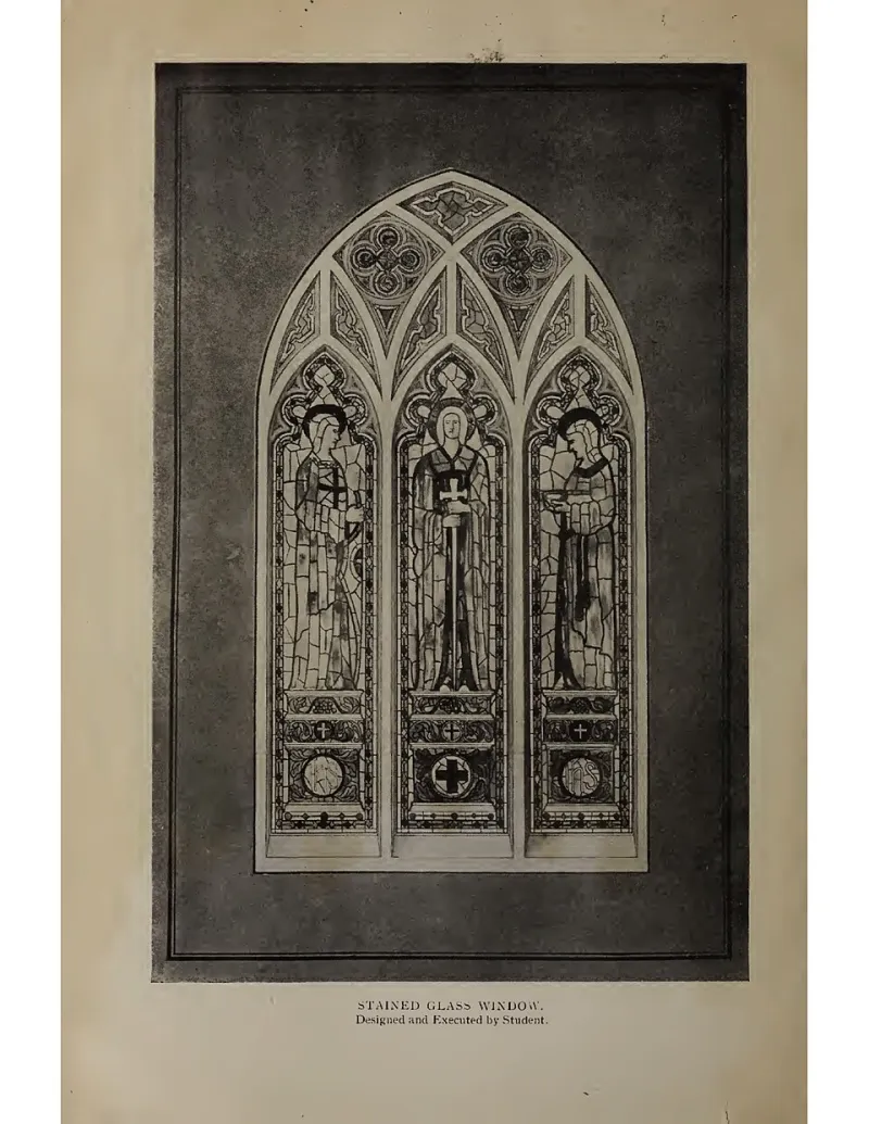
Photo: Unknown, CC0, via Wikimedia Commons
At H&P Stained Glass, we spend a lot of time looking at glass in less-than-tropical light. That is not a complaint. Britain’s overcast sky is a generous, even source of illumination, and it can make stained glass feel intimate rather than theatrical. The trick is to stop designing for brilliant sunshine and start designing for the light you actually get.
Grey is not the enemy
A bright day gives you beams, shadows and dramatic colour throws. A grey day gives you something quieter: a glowing surface, a gradual shift of tone, a window that reads like a painting rather than a projector. Diffuse light flatters texture and subtle colour, but it can flatten overly dark or heavily saturated glass into muddy shapes. That is why a panel that looks fabulous in a south-facing showroom can feel dull in a north-facing hallway.
The practical question is not “how much colour can I pack in?” but “how will this glass behave when the light is soft?” Once you work with that, grey skies become an asset.
Opacity: decide where the light lands
Opacity controls whether light passes through the glass or stops at its surface. In diffuse light, heavily opalescent glass tends to glow from within, while clear cathedral glass lets you see texture and movement. Neither is better; they do different jobs.
For north-facing rooms, a panel with a good proportion of opal can feel like a soft lamp even on a dull afternoon. If privacy matters, dense opal is your friend. If you want sparkle, use clear textured glass in the centre and save the denser glass for borders. For garden studios, think about the view behind the panel: a busy fence or shed wall will compete with clear glass, so opal or semi-opal can simplify the composition.
Church windows need a different balance. Too much dark glass in a nave can make a grey day feel gloomy, especially where the window is high and the light is already weak. A clearer matrix with concentrated colour in the figures or borders often works harder than an all-over dark scheme.
Texture: the quiet special effect
Texture is where diffuse light really earns its keep. Seedy glass, hammered glass, reamy glass and fracture glass all catch soft light and break it into tiny variations. In direct sun, these textures can look busy. In overcast light, they add life without shouting.
A simple test is to hold two samples side by side: one smooth opal, one textured clear. On a grey day, the textured clear often looks more interesting because the light has something to do. Use texture to create movement in large areas of pale glass, and use smoother glass where you want a clean, calm field of colour.
Palette for grey days
Warm whites, soft golds, amber, pale greens and muted blues are reliable performers in UK light. They lift a room without demanding direct sun. Deep purples, dense reds and very dark blues can still work, but they need contrast and careful placement. Put them next to a clear or pale opal area so they have something to sing against.
For north-facing rooms, lean towards warm neutrals and one or two stronger accents. For garden studios, echo the planting: greens, soft yellows, a little sky blue. For church windows, cool blues and greens can feel serene, but add warm infill so the window does not go cold and heavy.
Before and after: three quick examples
Before: a north-facing kitchen window with clear float glass and a thick dark red border. On grey days it read as a dark frame with no centre of interest. After: a reamy clear centre, a few amber squares and a narrow opal border. The window now glows softly and the kitchen feels warmer without extra lighting.
Before: a garden studio panel in deep cobalt blue. It looked rich in summer sun but nearly black in winter. After: pale gold and clear seedy glass with a green edge. The panel now holds its colour all year and frames the allotment view instead of blocking it.
Before: a church side window with dense ruby glass across the whole design. It felt heavy on overcast mornings. After: a clearer background with ruby reserved for the central motif and a warm amber border. The window still has drama, but the nave feels lighter.
The north-window test
You can do a useful version of this at home. Tape small samples of your shortlisted glass to a north-facing window on a grey day. Stand back at one metre, then three metres. Look at them in the morning and again in the afternoon. Take a phone photo without filters; the camera is honest about contrast.
Make a simple card with your samples and note which ones glow, which go flat and which disappear. If you are commissioning a panel, ask your maker for samples in the same opacities and textures you are considering. A good studio will expect the question.
Diffuse light is not a compromise. It is a different design brief, and often a more forgiving one. Choose glass that works with the sky you have, and your window will earn its place every day of the year.