Beyond the Picture Window: Geometric Stained Glass for Modern UK Interiors

There is a useful moment in any stained-glass conversation when someone says, ‘But what will it actually show?’ It is a fair question, and for churches, front doors and memorial windows the answer is often a person, a symbol or a scene. In a modern home, though, the better answer is sometimes nothing at all. A geometric panel can give a room colour, rhythm and a quiet layer of privacy without turning the window into a picture. It works with the architecture rather than competing with it.
Why geometry earns its place
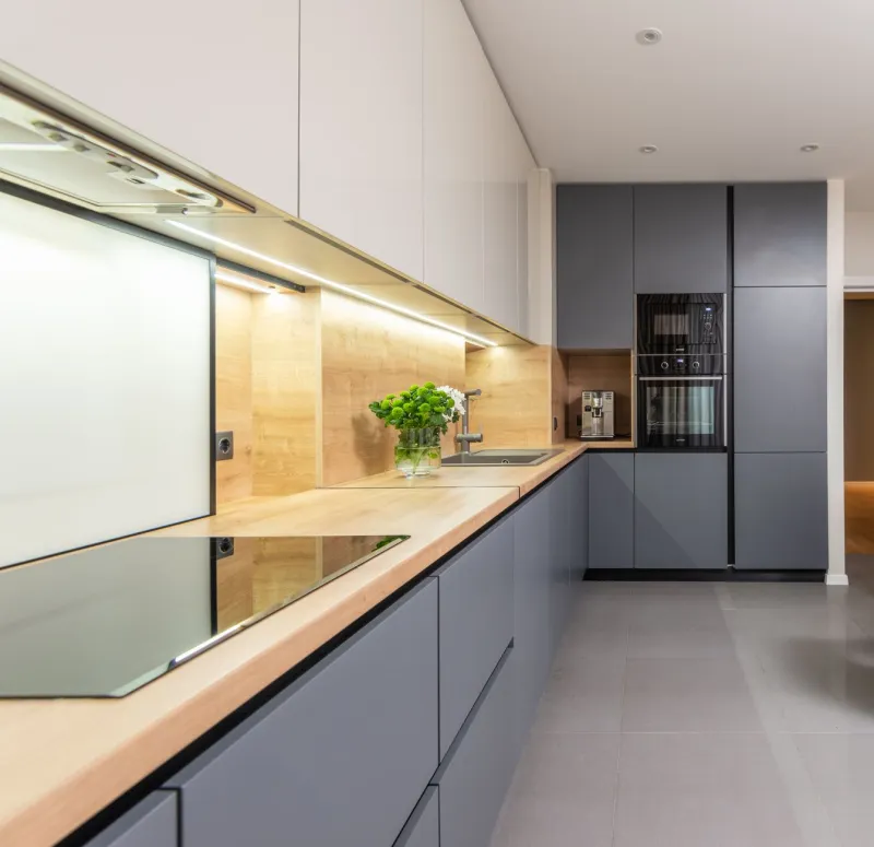
Figurative glass asks you to look at it. Geometric glass asks you to look through it, past it, and around it. That distinction matters in a contemporary interior where the window is one element among many: a wall of lime plaster, an oak lintel, a run of kitchen cabinetry, a steel-framed door. A repeating grid or a field of offset rectangles can echo those lines without shouting over them. It also ages well. A panel built from simple modules and a restrained palette tends not to feel dated in the way a very specific pictorial scene might.
There is a practical side too. Geometric designs are excellent at controlling privacy. Dense leading, textured glass and careful placement can obscure a street view at eye level while leaving the top of a window clear for daylight. You get light without net curtains, and a bit of colour without committing to a mural.
Reading the light before choosing colour
British daylight is not a single thing. A north-facing window gives a cool, steady light that can make strong reds and deep blues feel heavy. Amber, gold, pale green and soft grey often work harder in that situation, warming the room without turning it gloomy. A south-facing window is a different beast: it can carry richer colour, but it can also throw heat and glare. In a sunstruck room, paler tones and a higher proportion of clear or lightly textured glass usually feel more comfortable.
A useful rule is to choose the palette at the window, not on a sample board in the middle of the room. Take a few glass samples and prop them against the frame at different times of day. Morning light is not afternoon light, and a colour that looks lively at noon can look dull by four o’clock. For modern homes with grey skies for much of the year, a little warmth goes a long way. A panel that is too cool and too dark can make a small room feel like a aquarium on a wet Tuesday.
Lead lines as architecture
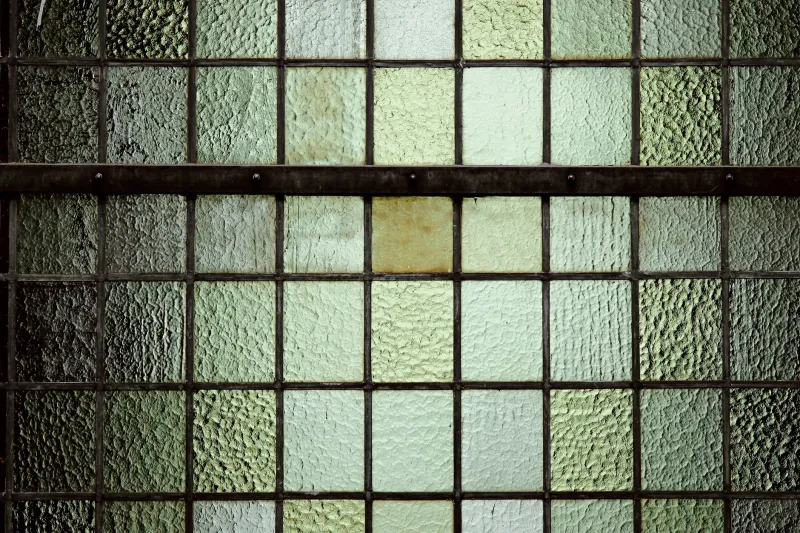
Lead came is not just a way of holding glass together. It is a drawing tool. In a geometric panel, the leading pattern is the design. A simple grid can align with wall tiles or timber battens. An offset square pattern can pick up the rhythm of a steel-framed window. A chevron or a run of verticals can add height to a room with a low ceiling.
Scale matters enormously. A small repeating pattern in a large window can look busy from across the room, while a large module in a small bathroom window can feel clumsy. As a rough guide, the pattern should be legible from the main viewing distance. If you are commissioning a panel for a stairwell, think about the view from the bottom step as well as the landing. If it is for a kitchen splashback, think about the view from the kettle.
Matching the panel to plaster, timber and steel
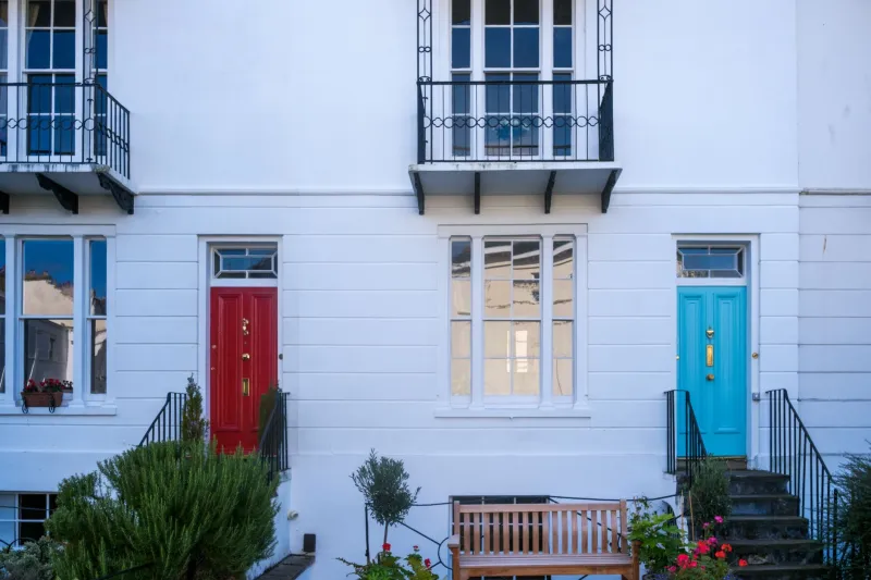
Modern British interiors often mix materials: smooth plaster beside rough oak, painted brick beside powder-coated steel. Glass can either bridge those textures or sit slightly apart from them. Slim lead lines tend to suit steel-framed windows and minimal joinery. A slightly wider lead or a traditional came profile can feel more at home in a Victorian terrace where the window already has weight and shadow.
The frame matters as much as the glass. An oak frame will warm a geometric panel and make it feel crafted. A painted timber frame can disappear into the wall, letting the pattern do all the talking. If the window sits within a steel screen, keep the leading fine and the palette simple so the whole assembly reads as one piece. It is worth asking for a full-size paper template or a digital mock-up before any glass is cut; geometry is unforgiving, and a pattern that looks balanced on a small screen can feel lopsided at two metres wide.
Privacy without a fortress
Geometric glass is particularly good at solving the awkward window: the ground-floor bay onto a pavement, the bathroom window overlooked by a neighbour, the side return that faces a brick wall. The trick is to vary the density. A band of denser pattern at eye level, with clearer glass above, gives privacy where it is needed and keeps the upper part of the window bright. Alternating clear and opaque panels can create a screen without making the room feel sealed in. Textured glass – seedy, hammered or reeded – adds another layer of obscurity while still letting light through.
This is also where abstract design outperforms pictorial work. You are not trying to hide a scene behind a pattern; the pattern is the point. A calm arrangement of rectangles can be just as private as a row of stylised flowers, and it will not clash with the sofa.
Commissioning a panel that belongs
Start with the room, not the pattern book. Note where the light comes from, what the window looks onto, and which materials sit closest to the frame. Decide whether the glass should recede or become a feature. Then choose a palette and a module size. Ask to see the leading layout drawn to scale, and check how the panel will be fixed and sealed. A well-made geometric panel should look deliberate from day one – not like a temporary measure waiting for a ‘proper’ design.
At H&P Stained Glass, we often find that the most successful modern commissions are the ones that resist the urge to tell a story in figures. Instead, they tell one in rhythm: a run of amber squares catching the afternoon, a grid of pale green softening a street view, a single bold line holding a room together. Pattern without pictures can be surprisingly eloquent.