Quiet Pages, Coloured Light: A Stained-Glass Brief for the Home Library
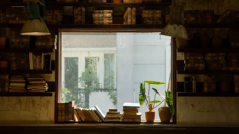
There’s a particular kind of quiet in a room built around books. It isn’t silence, exactly — more a settled atmosphere, the sense that the walls are holding stories rather than just plaster. Stained glass can deepen that feeling beautifully, but it can also ruin it if the room ends up too dim, too dazzling or too busy to read in. The trick is to design for the page first and the picture second.
Start with the reading light, not the picture
Before you fall for a motif, spend a week noticing how the room actually behaves. Which way does the window face? When does the sun hit it? Is there a hedge, a neighbouring wall or a bay window changing the story? A north-facing library in a Victorian semi will take rich colour far more happily than a south-facing box room in a modern flat, where a dense panel can turn a bright afternoon into a permanent dusk.
In small rooms, this matters most. A single window is often the only source of daylight, so over-darkening it is the classic mistake. Pale amber, soft greens, clear textured glass and restrained use of colour will keep the room usable. Save the deep blues and rubies for a border, a high transom or a panel that isn’t the main daylight provider. If you want the room to feel cocooning, you can still get that effect with texture and lead lines rather than a wall of dark glass.
Motifs that keep their company
A library panel has to live with you for years, so choose a subject you won’t tire of by the second winter. Literary motifs can work well — an open book, a fountain pen, a line of poetry, a character from a favourite novel — but they need editing. Too many references turn into a quiz. One clear idea, well placed, usually reads better than a collage of everything you love.
Botanical designs are often the safer long-term choice. A single oak leaf, a sprig of rosemary, a repeated seed-head or a simple tree canopy can feel literary without being literal. They also sit comfortably beside book spines, which are themselves a kind of pattern. If you want lettering, keep it short and treat it as part of the composition rather than a caption. A date, a house name or a few words can be lovely; a full quotation is harder to read in glass and can dominate the room.
Think, too, about the view from your favourite chair. You’ll see the panel at an angle for hours at a time, not straight on like a visitor. A design that looks striking in a photograph can become restless at the edge of your vision. Simple geometry, calm repeats and a limited palette tend to age better than high-contrast scenes.
Let lead lines do the quiet work
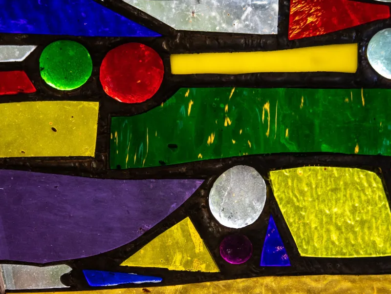
Lead lines are not just structure; they are drawing. They can create rhythm, frame a view or break up a large expanse of glass. In a library, they’re especially useful for keeping a panel from feeling like a poster. A gentle grid, a border of small squares or a few sweeping curves can give the eye something to follow without competing with the books.
Texture is your other quiet ally. Reamy, seedy, hammered and softly cathedralled glasses scatter light rather than throwing it. That reduces glare on pages and screens, and it gives the room a softer, more forgiving atmosphere. Clear textured glass can be surprisingly characterful — it offers privacy and sparkle without stealing daylight. Use smooth, saturated glass sparingly, perhaps in a central motif or a lower border where it won’t sit directly in your eyeline.
Fit the panel around the room
Bookcases change everything. A floor-to-ceiling run of shelves will block light and cast shadows, so plan the window before the joinery if you can. If the shelves are already there, consider a panel above them, beside a reading chair or in a door rather than in the main window. A stained-glass panel doesn’t have to be the biggest window in the room; sometimes a smaller side light or a transom gives more pleasure because it isn’t asked to do all the work.
Seating matters as much as shelving. A window behind a chair can silhouette the reader and throw glare onto the page. A panel to the side, or one that sits higher than the seated eyeline, is often kinder. If you use a desk or a laptop in the library, check the screen from where you actually sit. Bright glass directly opposite a monitor is a recipe for squinting. Textured glass, a deeper reveal or a simple blind can all help, but it’s easier to design the problem out from the start.
Artificial lighting deserves a place in the brief, too. A stained-glass window is not a lamp. It needs help in the evening, and the wrong bulb can make the glass look flat or muddy. Warm, diffused light from a floor lamp or a picture light can bring out the colour without turning the room into a stage set. Avoid placing a bright pendant right in front of the panel, where it will reflect and wash out the design.
The pitfalls worth naming
The first is over-darkening. The second is glare. The third is a composition that is too busy at eye level. A fourth is forgetting how the window opens, if it does — a fixed panel is one thing, but a casement that needs to swing clear of a curtain or a chair is another. In conservation areas or listed buildings, consent and repair sensibilities may also shape what’s possible, so it’s worth checking before you get attached to a design.
A good commission starts with a proper conversation: measurements, photographs, compass direction, how the room is used and what you want to feel when you walk in. Ask to see glass samples in your own light. A colour that looks rich in a studio can turn grey in a cloudy Yorkshire afternoon, and a textured glass that seems subtle on a bench can sparkle like a jewel in a sun trap.
Get that right, and the window becomes part of the room’s quiet machinery — not a showpiece you have to work around, but a soft, coloured backdrop for all the reading you plan to do.